Color is integral to the human experience. It informs many of the choices we make daily, both directly and indirectly. So much of what is important in our lives involves the expression of color. But our experiences are highly personal because each of us interprets color a bit differently. The colorblind among us, for instance, have difficulty differentiating between reds and greens.
How do we perceive color? An abbreviated answer is this: objects absorb and reflect light. Special receptors in our eyes transmit those various lightwaves to our brains where they are interpreted as color sensations.
Because of social conditioning, we humans have developed our own internalized criteria for determining what the appropriate use for given colors are in every facet of our lives (i.e. girls wear pink, boys wear blue). We do this, it is thought, to satisfy our psyches emotionally. Color, therefore, affects our minds and it affects our behavior.
Our ability to perceive color puts the world of fashion at our fingertips. Our clothes and the jewelry we wear to embellish them make our bodies appear interesting and sexually attractive. Thus, color considerations require immense respect during the design phase because without proper color combining, jewelry especially would lack in vitality and be tremendously uninspiring.
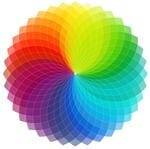
If color associations matter then, how are protocols established for color use in the world of fashion? Most industry professionals are informed by the color wheel; it’s a circular tool that shows the colors of the rainbow in relationship to each other (our eyes are tuned in to the rainbow spectrum of light). The color wheel allows artists the freedom to make neutral and mutually beneficial selections to enhance their designs.
For example, let’s say the main color in a particular sketch is determined to be red. Subsequent corresponding colors might need to be appointed to either complement and/or contrast the dominant red color.
Using the wheel below, find the color red. To it’s right, you will notice shades of orange; to its left, shades of purple. Opposite red on the wheel are various hues of aqua. A couturier might settle for both orange and purple (among other colors) to complement the red in her design. She might also choose aqua (among other colors) for contrast.
So, each of the selections from the color wheel will necessarily have close physical associations to the salient color in the design.

Many of us admittedly feign ignorance to the science of color and its effects on life (myself included), unless by necessity, we are obliged to partake in its interest and wealth of intrigue. Color is fun. The depth and breath of its scope is limitless which makes it a fascinating topic on many levels.
So, what is the color of life? Well… life is whatever color we want to consign to it. Our expressions of color are nuanced by how we live our lives. And conversely, our lives are nuanced by expressions of color. How we interpret and experience those colors is what helps to give our lives and our world increased meaning!
Here’s wishing you dreamy dreams and colorful visions!
